Full Screen Toggle
This is used on page /online-puzzle-simulators/
This page is just a demonstration of the custom styles this website is using 🙂
~
Heading 1
Heading 2
Heading 3
Heading 4
Heading 5

~
~
<span class="rots">F' R' U' L' D'</span>
F'R'U'L'D'
~
Scroll to id link:
<a href="#anchor1" class="scrollLink">Scroll to anchor 1</a>
<span id="anchor1">Anchor 1</span>
Click here to scroll to anchor 1
~
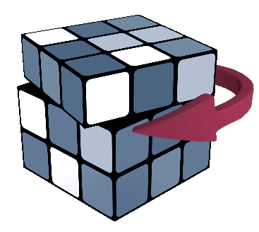
U: Up face clockwise
~
~
<div class="sendThisToSidebar"> This should show on the top of sidebar </div>
~
imageright
 An image floated to the right.
alertRightSide
For the Advanced Notations click here.Alert right side
Bigbutton
Rubik's Cube and Twisty Puzzles >>
Anchor 1 - This is just an anchor for the scrolling link
1. Two Cards — .ig-grid-2
A clean two-column layout for paired concepts, choices, methods, or related explanations.
Both cards stay side by side until mobile, where each card gets its own row.
2. Three Cards — .ig-grid-3
Good for three related ideas or three stages of a short process.
At medium width this becomes a two-column layout.
On mobile every card gets a separate line.
3. Four Cards — .ig-grid-4
4. Statistic Cards — .ig-stat
5. Feature Cards — .ig-feature
Use a compact visual mark with a title and short explanation.
Useful for article navigation, summaries, or featured subtopics.
6. Split Comparison — .ig-compare
Fewer concepts to learn, easier to remember, and suitable for casual solving.
More algorithms to learn, but better optimization and faster execution potential.
7. Pros and Cons — .ig-procon
✓ Advantages
- Easy to scan
- Highlights positive points
- Works well in reviews
× Disadvantages
- Needs concise content
- Long lists become noisy
- Best used selectively
8. Four-Step Process — .ig-steps
Look at the current state.
Choose the next operation.
Perform the move or action.
Check the result before continuing.
9. Numbered Article Rows — .ig-number-row
Use this style where every numbered item needs a little more explanation than a normal list item.
The number remains visually strong without taking over the entire layout.
This is useful in tutorial-heavy pages.
10. Key Takeaway — .ig-takeaway
11. Info / Tip / Warning Callouts — .ig-callout
12. Metric Bars — .ig-metrics
13. Definition / Glossary Cards — .ig-definition
- Algorithm
- A predefined sequence of moves used to achieve a specific result.
- Permutation
- The arrangement of puzzle pieces without necessarily changing their orientation.
- Orientation
- The direction a piece faces while remaining in a given position.
14. Pull Quote — .ig-quote
A strong pull quote can break up a long article and make one memorable idea stand out.
Example article highlight
15. Topic Pills / Tags — .ig-pill
16. Compact Data Rows — .ig-data-row
17. Big Fact Strip — .ig-fact-strip
18. Label Cards — .ig-label-card
A subtle category ribbon makes cards easier to scan.
Good for articles mixing theory, examples, and notes.
The layout stays clean even with several categories.
myFakeGallery
Title 2
prevNextButtons
bigLinkList
I – R’ (Y perm without F moves) R
R – F2 (Y perm without F moves) F2
Year Timeline
| 1974 |
The cube is invented
|
| 1975 |
Patent obtained
|
| 1977 |
Test batches released in Hungary
|
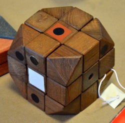
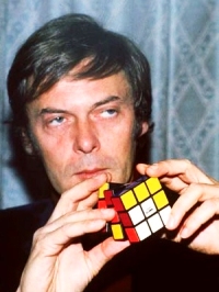 In 1975 Rubik received a patent for his “Magic Cube” in Hungary.
 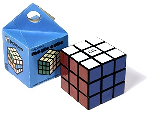 The cube was released for the first time in Budapest toy shops in late 1977. The version that was released meant the cube could not easily be pulled apart or broken, ideal qualities of children’s toys.
algChain